
The Admissions Page: Anatomy of a Treatment Center Page That Gets Calls

Sep 25, 2026 · 17 min read
The admissions page gets a different visitor from the rest of a treatment center website. The homepage is read by people who are still working out whether they need help. The admissions page is opened by someone who has mostly decided and now wants to know what happens if they pick up the phone: who answers, what they will be asked, whether insurance covers it, and how soon a bed could be ready. It is the last page before contact, and on many sites it is the least designed page of all.
So we went and read them. On 25 September 2026 we took the treatment providers ranking for rehab searches in a dozen US metros, followed the admissions link on each homepage and opened that page on a phone-sized screen. This article walks through what an admissions page has to answer, in the order a caller needs the answers, with what 44 ranking centers actually put there.
The answer, briefly
An admissions page that gets calls answers five questions before it asks for anything: who will pick up and when, what the steps are and how long each takes, which insurance plans are accepted and which are not, what the form will ask, and how fast someone replies. It then adds what to bring, one plain privacy sentence and a line for people who cannot wait. In our census of 44 admissions pages, 34 had a call button on the first screen, but only 15 laid the process out as numbered steps, 5 said which coverage they do not take, 3 of the 21 with a form said how fast they reply, and none published a price.
What 44 admissions pages showed us
The searches covered Philadelphia, Chicago, San Diego, Boston, Atlanta, Houston, Los Angeles, Delray Beach, Austin, Denver, Phoenix and Nashville, and they produced 65 providers with their own websites. Directories, lead generation sites, hospitals' general pages and government listings were set aside, and so were our two clients in Phoenix, so we were not grading our own work. Eight of the 65 blocked an automated browser, and 13 more had no link from the homepage to a page with admissions or intake in its address. That left 44 admissions pages.
We opened each one in headless Chrome with a 390 by 844 pixel viewport and an iPhone user agent, then read it about twelve seconds later, before any click. We recorded the phone links and whether anything covered them, measured every form built into the page, logged the third-party code the page requested, and saved the full text so each count below could be checked by hand. Where a keyword search disagreed with the page, the page won: three sites the script flagged as having numbered steps turned out to be a date picker, a list of intake questions and a list of outpatient services, and they were not counted.
Two patterns stand out. The first is that these pages are built around the phone call and not much else. Every one of the 44 had a tap-to-call link somewhere, and 31 still had one on screen after we scrolled 2,000 pixels down. The second is how much of the caller's homework is left for the call itself. Most pages told the visitor to phone and find out, when the same answers could have been written down once.
A caution about what a census can see. We read the page as a first-time visitor would, with no login and no clicks. We cannot see how quickly each admissions team answers the phone, how kind they are when they do, or how many families each page turns into admissions. The numbers describe the page, not the people behind it.
The anatomy, top to bottom
The order matters as much as the parts, because a caller reads an admissions page as a sequence of fears being answered. Can I reach someone now? What will happen to me or my son? Can we afford it? What will I have to tell them? Here is the order we build in.
None of this is exotic, and the 44 pages we read had every one of these parts somewhere between them. What almost none had was all eight, in an order that follows the caller rather than the org chart. The sections below take them one at a time.
1. The first screen: who answers, and when
The first screen should say that a person answers, what that person does, and when they are available, next to a button that dials. On 34 of the 44 pages a call link sat on the first screen with nothing covering it, so the button itself is rarely the problem. The label and the promise around it are where pages differ.
Twenty-six pages used "24/7" or "around the clock" somewhere, which is the right promise for a service people often reach for at night. The pages that described who answers did it by job title: an admissions specialist, an admissions coordinator, an admissions counselor. None of the 44 named the person. That is a missed opportunity on the one page where a stranger is deciding whether to trust a voice they have not heard yet. A first name, a photograph and a sentence about how long they have done this job cost nothing, and they turn a switchboard into a person. Staff change, so the page has to be updated when they do, but that is an hour's work.
The first screen should also offer a way in that is not a phone call. A parent in an open-plan office cannot discuss a child's drug use at their desk, and plenty of people can type what they cannot yet say. A two-field callback request or a text option placed beside the call button catches them. We looked at homepages that do this well in our twelve addiction treatment website examples; the admissions page needs the same second door.
2. The steps, with times attached
A family wants to know what happens after the call, and a numbered list of three to five steps with a time on each one answers that faster than any paragraph. Fifteen of the 44 pages numbered their process. The rest described it in prose, split it across several pages or left it for the phone.
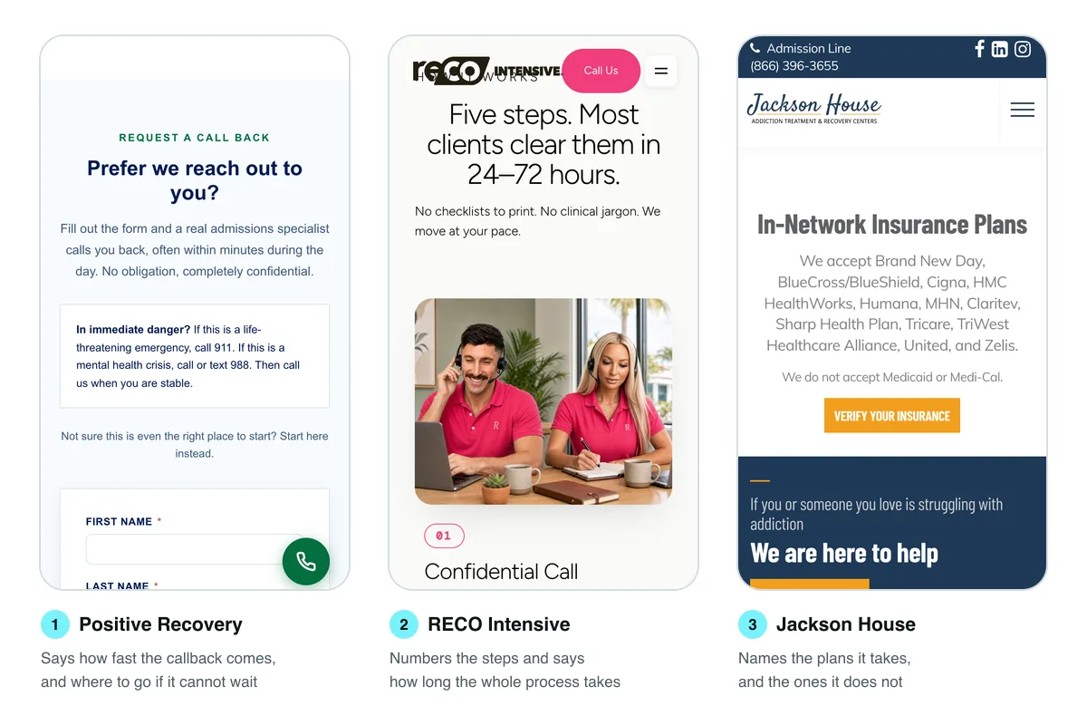
The best of the fifteen put a duration on every step, and one page does it better than we could describe it. RECO Intensive's admissions page opens its process section by saying there are five steps and that most clients clear them in 24 to 72 hours, and then says the first call is a 15 to 20 minute conversation. Positive Recovery says its four steps mostly happen in a single conversation. Those are promises a center has to keep, which is exactly why they persuade. A time on each step turns a vague ordeal into something with an end.
Be honest about the step that varies. Same-day admission came up on 8 of the 44 pages, and it is a strong promise when a bed and a clinical assessment allow it. The careful versions add a qualifier: same day when it is clinically appropriate. The reckless versions promise a bed tonight to everyone, and a family who is then told to wait learns that the website was not telling the truth.
3. The insurance block: names, not logos
The insurance section should list the plans you are in network with, in text, and then say which ones you do not take. Only 14 of the 44 pages named even one insurer in their text. Counting logos too, 22 did. And just 5 pages said which coverage they do not accept.
Text matters more than logos for three reasons. Logos are images, so a search engine or an AI assistant reading the page may not know what they say. They are often a strip of eight brands that tells a Medicaid family nothing. And they cannot carry the most useful sentence on the page, which is the negative one. Jackson House, in San Diego, lists its in-network plans by name and then writes, "We do not accept Medicaid or Medi-Cal." Twin Lakes Recovery Center, near Atlanta, says it does not accept Ambetter or Medicaid and still asks the family to call so it can help them find care. That second half is the part to copy: a no that leads somewhere is still service.
It is also cheaper than it sounds. Saying up front which plans you cannot bill saves your admissions team the calls that were never going to become admissions, and it saves the family an hour on hold. We covered what a certification reviewer expects from insurance language in what LegitScript actually reviews on your website; naming plans honestly is part of it.
Price is the other half of this block, and the census found a gap. Eighteen pages mentioned self-pay or private pay. None of the 44 published its own price or a range for its own programs. Two quoted national averages instead: one said detox programs can average between $250 and $800 a day, and another said a 30-day inpatient program can range from $6,000 to $30,000 or more. A national range is better than silence, but it answers a question the family did not ask. Many centers have good reasons not to post a single number, since the cost depends on the level of care, the length of stay and the plan. A typical self-pay range per level of care, labeled as typical, still does more than a phone number.
Verification speed is worth stating too, because the machinery behind it is mostly electronic now. The 2024 CAQH Index, the industry's annual count of administrative transactions, found that 96 percent of medical plans' eligibility and benefit checks were fully electronic, and that a medical provider saves an average of 12 minutes per check by doing it electronically instead of by phone or fax. If your team can confirm benefits in minutes, the page should say so.
4. The form: seven fields is the median, five is enough
An admissions form should ask only what a person needs to call back and start a benefits check: a name, a phone number, the insurer and the best time to reach them. Twenty-one of the 44 pages had a form built into the page, and 5 more embedded one from a form service, which we could not measure. Across the 21, the median form had 7 fields. The shortest had 3. The longest had 31 inputs, 17 of them required, including the last four digits of the patient's Social Security number.
For a comparison from a field that measures forms obsessively, the Baymard Institute's checkout research found that the average US checkout in 2024 had 11.3 form fields, and that most sites need only 8 for the whole checkout. A checkout has a shipping address and a card number to collect. An admissions request does not, and it is being filled in by someone who may be frightened, tired or on a cracked phone screen at two in the morning. Baymard also found that 17 percent of shoppers had abandoned a checkout because of its complexity. There is no reason to think a worried parent is more patient than a shopper.
Look at what the longer forms asked for. Seven of the 21 wanted an insurance member ID and five wanted a date of birth. Both are needed for a full benefits check, so there is a case for asking, as long as the fields are optional and the form still submits without them. Four asked how the person heard about the center. That is a marketing question, and it belongs in the call-tracking data or in the conversation, not in the way of someone asking for help.
The form also has to work for people with disabilities, which is a legal and a practical point at once. WCAG 2.2, the W3C accessibility standard, requires labels or instructions wherever a page asks for input, at level A, and at level AA it requires that fields collecting personal information can be identified by the browser, which is what lets a phone fill in a name and number in one tap. It also sets a minimum target size of 24 by 24 CSS pixels at level AA, with some exceptions, which rules out most of the tiny checkboxes and radio buttons many form plugins ship with.
5. What happens after they press send
Next to the submit button, say who will reply, how they will reply and how fast. Only 3 of the 21 pages with a form did. Tree House Recovery in Nashville says it will get back to you within 24 hours. Positive Recovery, in Texas, says an admissions specialist will often call back within minutes in the daytime. Beacon Point Recovery Center, near Philadelphia, says a representative will call back within minutes. The other 18 left the visitor to guess.
The promise matters because the reply time decides what the form is worth. When researchers writing in Harvard Business Review submitted test web inquiries to 2,241 US companies, 37 percent responded within an hour and 23 percent never responded at all. In a separate analysis of 1.25 million sales leads, the same research found that firms which tried to reach a prospect within an hour were nearly seven times as likely to have a meaningful conversation as firms that waited even one more hour, and more than 60 times as likely as firms that waited a day or longer. That study is about sales leads from 2011, not treatment admissions, so treat the multiples as a direction rather than a forecast. The direction is hard to argue with. A family that filled in a form at night and hears nothing by morning has usually called someone else.
So the promise on the page is also a staffing decision. If nobody reads the form inbox on Saturday night, do not write "within minutes". Write the promise you can keep, and then keep it.
6. Privacy, said once and meant
One plain sentence beside the form, saying that the conversation is confidential and how the information will be used, does more than a paragraph of legal language at the bottom. Twenty-six of the 44 pages used the word confidential, and 11 mentioned HIPAA. Two mentioned 42 CFR Part 2, the federal rule that protects substance use disorder treatment records. Under the 2024 update to that rule, published in the Federal Register on 16 February 2024, covered programs had to comply by 16 February 2026.
The sentence is the easy part. The harder part is what the page does behind the sentence. We logged the third-party code each admissions page requested before any click.
Twenty-seven of the 44 pages loaded code from an advertising network: Google's ad domains, Meta or Microsoft Bing. Eight loaded the Meta pixel. Fourteen loaded a session recording script, which records how visitors scroll, tap and move through the page. Of the 21 pages with a form built in, 12 also loaded advertising code. We want to be exact about what that does and does not show. Loading a tag is not the same as sending health information to an advertiser; many sites configure these tools carefully, and our census did not submit any forms. It does mean the question has to be asked, page by page, by someone who can read the configuration.
The regulators have already said why. The HHS Office for Civil Rights guidance on online tracking technologies gives, as an example of a disclosure that brings HIPAA into play, a tracking tool that collects a person's email address or the reason they are seeking care when they book an appointment on a public page. A federal court in June 2024 vacated a different part of that guidance, the part about linking a visitor's IP address to a visit to a public page about a health condition, and the scheduling example was not what the court removed. Separately, in April 2024 the Federal Trade Commission settled with Monument, an online alcohol treatment company, over allegations that it shared users' health information with advertising platforms through pixels. The order carried a $2.5 million civil penalty, suspended because the company could not pay, and a ban on sharing health data for advertising. The FTC said the data of as many as 84,000 users was involved.
We are a design and development agency, not a law firm, and whether HIPAA or Part 2 applies to your program is a question for your counsel. But the practical rule for an admissions page is simple enough: the form, and anything that can see the form, should send data only to systems your privacy officer has approved in writing. We go further into business associate agreements and analytics set-ups in what a HIPAA compliant website actually requires.
7. Arrival: what to bring, and how to get there
The admissions page is where logistics belong, because the person reading it is already planning the day. Twenty-five of the 44 pages said what to bring or linked to a packing list, and 11 mentioned travel or transportation. That makes arrival the best-covered part of the page after the phone button.
The good lists are specific. They say how many days of clothes to pack, whether there is laundry, that prescription medication should come in its original labeled bottles, and which items are not allowed, from mouthwash containing alcohol to laptops. A family packing a bag for someone in withdrawal does not want to discover the rules at the door. If the list lives on its own page, link it from the admissions page with a descriptive label rather than burying it in a footer menu.
Travel deserves a sentence even for local centers. Say whether you arrange pickup from the airport or the bus station, whether a family member can drive the patient in and stay for the intake, and how long intake takes on arrival. Those three facts settle most of the nervous calls that come in the day before admission.
8. The line for people who cannot wait
Every admissions page should say, in plain words, what to do if the situation is an emergency: call 911 for a medical emergency such as an overdose, and call or text 988 for a mental health crisis. Only 2 of the 44 pages did. Positive Recovery's version is a good model: a small box beside the form, headed with a question about immediate danger, that gives both numbers and then says to call the center once the person is stable.
This is not about conversion, and it will not appear in anyone's lead report. An admissions page is read by people in the worst week of their lives, and some of them are in danger while they read it. The 988 Suicide and Crisis Lifeline takes calls, texts and chats, and says it is available 24/7/365. A treatment center's admissions line is not a crisis service and should not pretend to be one. One sentence that points to the service that is costs nothing and may matter more than anything else on the page.
An admissions page brief you can hand to anyone
You do not need an agency to fix most of this. Give the table below to whoever edits your website, whether that is your marketing lead, a freelancer or us, and ask them to check each row against your live page on a phone.
| Part of the page | The question it answers | Minimum content | In our census |
|---|---|---|---|
| First screen | Can I reach someone now? | A labeled call button, the hours, a callback or text option | 34 of 44 had an uncovered call link |
| Who answers | Who will I be talking to? | A first name, a photo, a line about their role | 0 of 44 named a person |
| Steps | What happens after I call? | Three to five numbered steps with a time on each | 15 of 44 numbered them |
| Insurance | Can we pay for this? | Plans taken and plans not taken, in text | 14 named an insurer, 5 said what they do not take |
| Price | What if we pay ourselves? | A typical self-pay range per level of care | 0 of 44 published their own |
| Form | What will I have to tell them? | Name, phone, insurer, best time; the rest optional | Median 7 fields, longest 31 |
| Reply promise | When will someone call me back? | A time you can keep, next to the submit button | 3 of 21 forms said |
| Privacy | Who else will see this? | One plain sentence, and tracking that matches it | 26 said confidential; 12 of 21 form pages loaded ad code |
| Arrival | What do we bring, and how do we get there? | A specific packing list and travel options | 25 of 44 said what to bring |
| Emergency line | What if this cannot wait? | 911 and 988, in one sentence | 2 of 44 |
If your page fails more than three rows, a rewrite of the words will probably do more than a redesign. If it fails the privacy row, fix that first, before any change that would send more traffic to the page.
Where we fit, and who should skip us
We design and build treatment center websites, and the admissions page is usually where we start, because it is the page with the shortest path to an admission. After our redesign, Cornerstone Healing Center's website conversions rose 20 percent. For a second opinion before you commit to anything, ask for our free funnel review: we look at the page where your visitors really arrive, which is often the homepage or an ad's destination, and write down what we would change. Everything we do for addiction treatment and recovery centers is sold as one of three monthly tiers, priced openly on our pricing page and paused or cancelled whenever you like. The entry tier, Foundation Partner at $1,000 a month, launches a high-converting landing page within 14 business days of receiving your content and assets, then adds a page every month. If the job is testing and tuning a page that already exists, that is our conversion optimization work.
Two kinds of center should not hire anyone for this. If your admissions team cannot answer a form within a few hours today, a better page will mostly generate faster disappointment; fix the staffing and the inbox first. And if your page already passes the brief above and still gets no calls, the problem is probably that too few people reach it. That is a search and referral problem, and we wrote about it in filling beds without buying leads.
Run the Saturday night test
The quickest way to find out how your admissions page performs is to use it the way a family does. Pick a Saturday, around ten at night. On your own phone, in a private browser window, open your admissions page from a Google search, not a bookmark. Fill in the form as a parent looking for detox for a son on a plan you accept, and note the time. Then call the number on the page and note who answers, how long it rings and whether they already know about the form.
Write down three times: how long the page took to show you what to do, how long the form took to fill in, and how long until anyone replied. Then do it once more with a plan you do not accept, and see whether the page or the person tells you so. Most centers who run this test find the fix is not on the website at all, or not only there. Either way, those three numbers are a better brief than any agency's proposal, including ours.
Frequently asked questions
A treatment center admissions page should include a labeled call button with the hours, a way to request a callback, three to five numbered steps with a time on each, the insurance plans accepted and not accepted, a short form, a promise about how fast someone replies, a privacy sentence, what to bring and a line pointing emergencies to 911 and 988. In our census of 44 ranking admissions pages, none had all of these.
Four required fields are enough for a first contact: a name, a phone number, the insurer and the best time to call. Member ID and date of birth can be optional fields for a faster benefits check. The median admissions form in our census had 7 fields, and the longest had 31 inputs, 17 of them required.
Yes, a typical self-pay range for each level of care, labeled as typical, helps families who are paying themselves decide whether to call. None of the 44 admissions pages we measured published its own price, and two quoted national averages instead. A range is honest when cost depends on the level of care, the length of stay and the plan.
Yes. Saying which plans you cannot bill saves families an hour on hold and saves your admissions team calls that will not become admissions. Only 5 of the 44 pages we measured did it, and the best examples still invite the family to call for help finding care elsewhere.
It can load them, but anything that can see the admissions form needs a privacy review first, because HHS guidance treats tracking that captures the reason a person seeks care as a possible disclosure of health information. The FTC settled with the alcohol treatment company Monument in 2024 over health data shared with advertisers through pixels. Ask your counsel whether HIPAA or 42 CFR Part 2 applies to your program.
Within the hour whenever possible, and the page should state the reply time you can actually keep. Research published in Harvard Business Review found firms that contacted web inquiries within an hour were nearly seven times as likely to have a meaningful conversation as those that waited longer. Only 3 of the 21 admissions forms we measured said how fast anyone would reply.
Yes, one plain sentence telling people to call 911 in a medical emergency and to call or text 988 in a mental health crisis. An admissions line is not a crisis service. Only 2 of the 44 admissions pages we measured included that sentence.
 Recovery
Sep 19, 2026 · 16 min
12 Addiction Treatment Website Examples Built to Convert
We loaded 37 ranking rehab homepages on a phone-sized screen and measured what a visitor can do first. These twelve each get one conversion job right, shown in annotated screenshots.
 Recovery
Sep 14, 2026 · 17 min
What LegitScript Actually Reviews on Your Website
LegitScript certifies the business, but five of its sixteen standards are read straight off your pages. We mapped each one to the page it lands on and checked 44 ranking treatment center sites against them.
 Recovery
Sep 11, 2026 · 18 min
Sober Living Website Cost in 2026: What to Budget When Ads Are Not an Option
Google lists sober living among the recovery services certified advertisers can promote. LegitScript, whose certification those platforms recognize, says a sober home without clinical staff does not qualify. We measured 49 operator websites to see what that leaves the website to do.