
12 Addiction Treatment Website Examples Built to Convert

Sep 19, 2026 · 16 min read
Most lists of treatment center website examples are portfolios. An agency picks twelve sites it likes the look of, several of them its own, and calls them the best. That tells you what a site looks like on a laptop in a pitch meeting. It tells you very little about what a frightened parent sees at eleven at night on a phone, which is the moment a treatment center website either gets the call or loses it.
So we did this one differently. On 19 September 2026 we searched for drug and alcohol rehab in twelve US cities, opened every provider homepage that ranked, and captured each one at the size of a typical phone. Then we measured what a visitor could actually do on the first screen, and what was still within reach after scrolling. The twelve examples below were chosen because each one does a single job well and the job is visible in a screenshot. One of them, Cornerstone Healing Center, is our client, and we say so every time it appears.
The short answer
Treatment center websites that are built to convert do the same few things on the first screen of a phone: a tap-to-call button that says who answers, a way to check insurance without phoning, a plain statement of which levels of care the center runs and where, and one piece of proof a stranger can check, such as a license, a bed count or an outcome with its method. The twelve sites below each show one of those well. In our census of 37 ranking rehab homepages, 28 had an uncovered call link on the first screen, but only 11 put an insurance check there and only 5 kept one on screen after scrolling.
How we picked the twelve
We started with the pages that already win the search, because those are the pages a new site competes with. We searched for drug or alcohol rehab in Nashville, Denver, Phoenix, Austin, Delray Beach, Los Angeles, Houston, Atlanta, Boston, San Diego, Chicago and Philadelphia, and kept every result that was a treatment provider's own page. Directories, lead generation sites, government pages and news stories were set aside. That left 45 pages. Seven answered an automated browser with a security wall or a 403 error and one timed out, so 37 were read.
Each page was loaded in Chrome at 390 by 844 pixels, the screen of a common iPhone, with an iPhone user agent. We recorded every tap-to-call link and insurance link, checked whether anything was sitting on top of them, scrolled 2,000 pixels down and checked again, and saved a screenshot of the first screen. Every example below was then reloaded and captured about three and a half seconds after the page began to load, which is closer to what a visitor sees before popups and chat windows open.
The phone is the right lens. Pew Research Center's 2025 survey found that 91 percent of US adults own a smartphone and 16 percent are smartphone-only internet users, with no home broadband at all. And the first screen matters more than the rest: in the Nielsen Norman Group's eyetracking research, people spent about 57 percent of their page viewing time above the fold and 74 percent in the first two screenfuls. That study used a 1920 by 1080 desktop screen, which shows far more of a page before the fold than a phone does.
Two findings from the census frame everything that follows. The call is handled well almost everywhere: 28 of 37 pages had a tap-to-call link on the first screen with nothing covering it, and on three more a link was there but a cookie notice or popup sat on top of it. The insurance question is handled far less well. Twenty-six pages linked to an insurance check somewhere, yet only 11 put that link on the first screen, and only 5 still showed it 2,000 pixels down. A family who does not want to talk yet, and many do not, has to go looking.
A word on what this is not. We cannot see anyone's conversion rate except our own client's, so none of these sites is ranked by results. They were chosen for a visible pattern that a design team can copy, and each one is described as it stood on the day we captured it. Websites change weekly.
Examples 1 to 3: the phone call
A call button works best when it says who picks up and stays within reach of the thumb. Three sites show three versions of that.
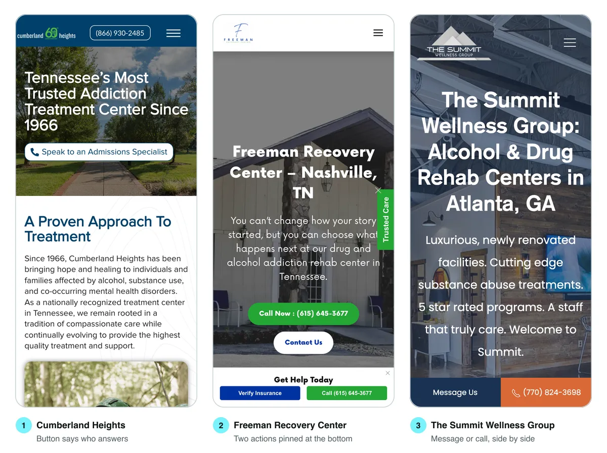
1. Cumberland Heights, Nashville. The button under the headline does not say "call now". It says "Speak to an Admissions Specialist", and tapping it dials. That label answers the question a nervous caller actually has, which is who will be on the other end. The headline carries the other piece of reassurance the site has earned: the center has operated since 1966, on a 177-acre campus outside Nashville. The trade-off is weight. The homepage moved about 3,487 KB to our test phone, one of the heavier pages in the census.
2. Freeman Recovery Center, Nashville. Freeman pins a bar to the bottom of the screen with two actions side by side: Verify Insurance and a call button. Both were still on screen when we scrolled 2,000 pixels down, which only four other sites in the census managed for the insurance link. It is also the lightest page we measured, about 171 KB. Nothing here is expensive to build. It is a decision to keep both doors open on every screen instead of choosing one.
3. The Summit Wellness Group, Atlanta. The Summit splits its pinned bar between "Message Us" and a phone number. The message option matters more than it looks. Some people cannot make a call from where they are sitting, and some are not ready to say the words out loud. Giving them a second channel that sits exactly where the call button sits is a small change with a clear purpose. The phone number itself changed between our three loads, which points to call tracking, a practice we come back to below.
Examples 4 to 6: the insurance question
For most families the first real question is whether they can afford it, and the strongest sites answer it before they ask for a phone call.
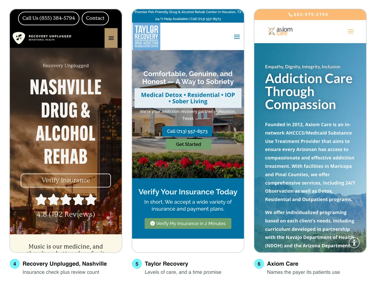
4. Recovery Unplugged, Nashville. The location page puts Verify Insurance directly under the headline and a star rating of 4.8 from 192 reviews directly under that. Insurance first, social proof second, and the music identity the brand is built on arrives in the very next line. The page weighed about 178 KB, the second lightest in the census. One thing we would add: the rating does not say where the 192 reviews live. Example 10 shows the fix in four words.
5. Taylor Recovery, Houston. Two good decisions sit above the fold. The levels of care are named in a box under the headline, Medical Detox, Residential, IOP and Sober Living, so a visitor knows in two seconds whether the center offers what they need. And the insurance button makes a promise: "Verify My Insurance in 2 Minutes". Setting an expectation like that lowers the cost of tapping. The honest caveat is what sits behind it. The verification form asks for 21 fields, 17 of them required, from the patient's address to the insured person's employment status. Insurance checks genuinely need a member ID and a date of birth, but a two-minute promise should lead to a form that can be finished in two minutes on a phone.
6. Axiom Care, Phoenix. Axiom names the payer its patients actually have. The page title reads "Drug & Alcohol Rehab Accepting AHCCCS", the name Arizona's Medicaid program goes by, and the first paragraph says it was founded in 2012 and is an in-network AHCCCS and Medicaid provider, with facilities in Maricopa and Pinal counties. For a center whose patients mostly carry Medicaid, "we accept most insurance" is weaker than naming the plan, because the family searching is typing the plan's name. Axiom has no insurance button on the first screen at all, and does not need one: the headline has already answered the question.
Insurance language is also one of the places a certification reviewer looks. We covered what LegitScript expects from insurance and outcome claims in what LegitScript actually reviews on your website, and the short version applies here: name the plans you take, and say which ones you do not.
Examples 7 to 9: sending people to the right door
A homepage has to serve a person in crisis, a parent researching options and a referring therapist, and the good ones route each of them in a single tap.
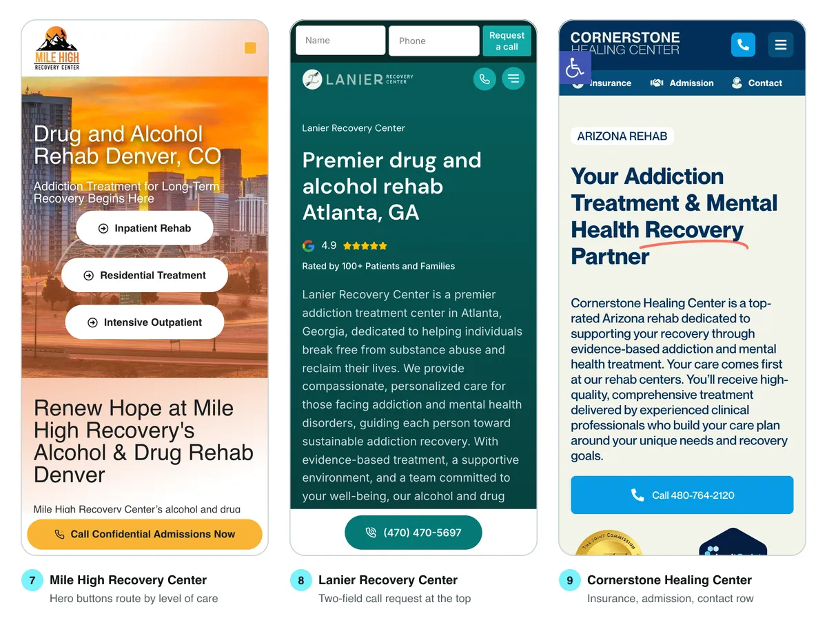
7. Mile High Recovery Center, Denver. The hero has three buttons, and each is a level of care: Inpatient Rehab, Residential Treatment and Intensive Outpatient, each linking to its own program page. A visitor who already knows they need outpatient care skips the whole homepage. Below them a pinned "Call Confidential Admissions Now" bar stays on screen as you scroll. The word confidential is doing real work there, because privacy is the fear most callers never say aloud.
8. Lanier Recovery Center, Atlanta. The very top of the page is a form with two fields, Name and Phone, and a button that says "Request a call". Two fields is the smallest form that can still produce a callback, and putting it above the logo is unusual enough to notice. It suits the visitor who wants help but cannot talk right now. Directly under the headline, Lanier shows a 4.9 Google rating "Rated by 100+ Patients and Families", and further down it lists the insurers it works with by name, from Cigna and Humana to Tricare, and says self pay is an option.
9. Cornerstone Healing Center, Scottsdale and Phoenix. Cornerstone is our client, so read this one with that in mind. The header carries a tap-to-call icon and, under it, a row of three links for the three jobs visitors arrive with: Insurance, Admission and Contact. A full-width call button sits under the introduction. After our redesign Cornerstone saw 20 percent more website conversions, which is the only conversion figure on this list we can vouch for, because it is ours. One honest note: in our first pass, captured nine seconds after load, a virtual assistant panel had opened over the lower half of that screen. At three and a half seconds it had not. It is a trade-off worth testing rather than assuming.
Examples 10 to 12: proof a stranger can check
Every rehab calls itself compassionate and evidence based, so the proof that persuades is the kind a skeptical reader could verify.
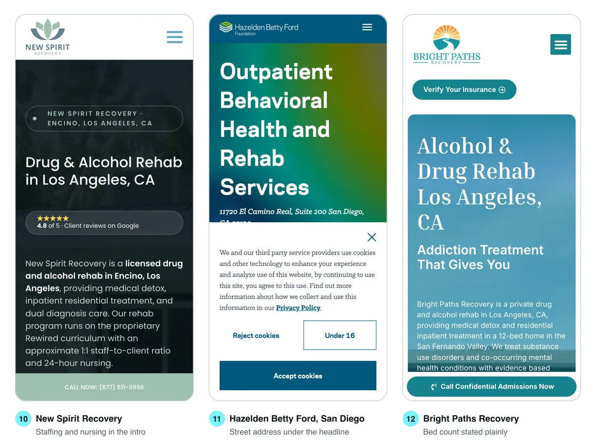
10. New Spirit Recovery, Los Angeles. The introduction reads like a fact sheet, and that is the compliment. It says the center is licensed, in Encino, and offers medical detox, residential treatment and dual diagnosis care, with an approximate 1:1 staff-to-client ratio and 24-hour nursing. Further down it lists Joint Commission accreditation and a California DHCS license, and says admissions answer 24/7 and same-day admission is available when clinically appropriate. That last qualifier is worth copying: it makes a fast promise without making a reckless one. The rating badge reads 4.8 of 5 and then "Client reviews on Google". Four words, and the reader knows where to check.
11. Hazelden Betty Ford, San Diego. The street address, 11720 El Camino Real, Suite 200, sits directly under the headline. That is the least glamorous item on this list and one of the most useful. A family wants to know how far away the building is, and LegitScript's website standard asks for the physical address of each facility to be shown conspicuously. Our capture also shows the cost of a cookie notice on a phone: it covered the lower half of the first screen, including the call button behind it. Hazelden was one of seven pages in our census where a consent notice sat over the first screen when the page loaded.
12. Bright Paths Recovery, Los Angeles. Bright Paths says what most centers hide: it is a 12-bed home in the San Fernando Valley, and further down, roughly three staff for every two clients. Small is a selling point for the right family, and saying the number turns a vague "personalized care" into something that can be pictured. The same page also says over 80 percent of clients who finish the program remain sober, and we found no method for that figure on the page. Compare Cornerstone's homepage, which says its outcomes are independently verified through MHO Outcomes using the BASIS-32 assessment before it gives its number. Name the measurement first, then state the result.
What a screenshot does not show
Three things decided how these pages performed on our test phone that no screenshot captures, and each is a decision a center's team can make.
Page weight. Across the census, the median homepage moved about 1,356 KB to the phone. The lightest, Freeman, moved about 171 KB. The heaviest moved about 15,850 KB. Weight is not the same thing as speed, but it is the raw material of slowness on a weak signal, and Google's guidance on web.dev is that the largest element on a page should appear within 2.5 seconds for at least 75 percent of visits. Our numbers come from one load per page on a fast connection in headless Chrome, so treat them as a comparison between sites, not a lab score.
Call tracking. Thirteen of the 37 sites served a different phone number on at least one of our two or three loads. That is almost always dynamic number insertion, where each visitor sees a number tied to the ad or page that brought them, so the center knows which marketing produced which call. It is a sensible practice. It also means the number on your site, your Google Business Profile and your certification paperwork may not match, so decide which one is the published main line and keep it consistent everywhere a reviewer or a family might compare them.
Consent notices. Seven of 37 pages opened with a cookie or privacy notice over the first screen. Some centers need one, depending on the privacy laws that apply to them and the tracking they run. But a notice that covers the call button on a phone is costing something every visit. A slim bar along one edge does the same legal job with far less in the way.
What we left off the list, and why
Several sites that rank well did not make the twelve, and the reasons are more useful than the omissions.
- Pages we could not read. Eight of 45 blocked our automated browser or did not respond. A real visitor would not see those walls, so this says nothing bad about them, but we will not describe what we could not capture.
- Hero sections with no action. On nine of the 37 pages we read, no call link was uncovered on the first screen: some had none there, and on three a popup or cookie notice sat over it. A few showed only a headline and a large photo, with the first button below the fold.
- Headlines that could belong to anyone. Several first screens opened with a line about hope or journeys and no mention of a city, a level of care or a payer. Those pages can still convert, but they make the visitor do the work.
- Our other client. Rock View Recovery, another site we built, also ranked in Phoenix. One client on a list of twelve is disclosure. Two starts to look like an advertisement.
If you want to see how agencies that build these sites compare, we wrote an honest guide to the best web design agencies for addiction treatment centers, and a breakdown of what a treatment center website costs.
Score your own first screen
You do not need an agency to find out where your site stands. Open your homepage on your own phone, in a private window so nothing is remembered, and check each row. Every row points to the example that does it well.
| Check on your phone | Pass looks like | See example |
|---|---|---|
| Call button on the first screen | Visible, uncovered, and labeled with who answers | 1, Cumberland Heights |
| Call button after scrolling | Still within reach of the thumb halfway down the page | 2 and 7, Freeman and Mile High |
| A way to reach you without calling | A message option or a short callback form | 3 and 8, The Summit and Lanier |
| Insurance check on the first screen | A button or link, not only a menu item | 4, Recovery Unplugged |
| The form behind that button | Only the fields a verification truly needs | 5, Taylor Recovery, as a caution |
| Payers named, not implied | The plans your patients actually carry, by name | 6, Axiom Care |
| Levels of care stated up top | Detox, residential, PHP or IOP, in plain words | 5 and 7, Taylor and Mile High |
| Where you are | A street address a family can put into a map | 11, Hazelden Betty Ford |
| Proof with a source | Reviews that say where, outcomes that say how | 9 and 10, Cornerstone and New Spirit |
| Nothing covering the first screen | No popup, chat panel or cookie notice over the buttons | 11, as a caution |
If the census is any guide, the call button will pass. The rows that fail are usually the insurance path, the proof and whatever has been layered on top of the hero since launch. To have someone else score it, our free funnel review looks at the page your traffic actually lands on, usually the homepage or whatever your ads point to, and our conversion optimization work picks up from there. For programs that need the whole site rebuilt, our work for addiction treatment and recovery centers runs on three monthly tiers with prices on our pricing page, and a focused landing page goes live in 14 business days from the day your content and assets land.
One group should not hire us for this. If your site already passes most of the scorecard and your problem is that nobody visits it, the fix is search and referrals, not a redesign. We say more about that in filling beds without buying leads.
The ten-second handoff
The last test is the one no census can run. Hand your phone, open on your homepage, to someone who has never seen your site: a friend, a relative, a new hire in another department. Tell them one thing: "Your brother needs detox and you have Aetna. Find out if this place can help." Then time them and say nothing.
Watch where their thumb goes first. If they find the insurance check in under ten seconds, your first screen is doing its job. If they scroll, open the menu, zoom into a paragraph or ask you where to tap, you have just watched what happens to a real family every night, and you have watched it without spending anything on ads. Run it with three people and write down exactly where each one hesitated. That list is your redesign brief, and it will be shorter and more accurate than any list of examples, including this one.
Frequently asked questions
A good addiction treatment website lets a worried visitor act from the first screen of a phone: call someone who is named, check insurance without calling, see which levels of care the center runs and where it is, and find one piece of proof they could verify. In our census of 37 ranking rehab homepages, the call was usually handled well and the insurance check was the most common gap.
Yes, and it should stay within reach as the visitor scrolls. In our census, 28 of 37 ranking rehab homepages had an uncovered tap-to-call link on the first phone screen, but only 20 still showed one 2,000 pixels down. A pinned bar at the bottom of the screen, as Freeman Recovery Center and Mile High Recovery Center use, solves both.
Put it on the first screen and keep it available as the reader scrolls. Only 11 of the 37 homepages we measured had an insurance link on the first phone screen and only 5 kept one on screen 2,000 pixels down, even though 26 linked to an insurance check somewhere. Recovery Unplugged places it directly under the headline.
Only the fields the verification truly needs, and your billing team can tell you which ones those are. One form we examined promised verification in two minutes and asked for 21 fields, 17 of them required. If you promise speed, count the fields and time yourself filling the form in on a phone.
Only when the page also says how the number was measured. Cornerstone Healing Center names the outcomes service and the assessment it uses before stating its result, while another site we reviewed published an 80 percent sobriety figure with no method on the page. LegitScript's standards require that claims be accurate and not misleading, so an outcome without a method is a risk as well as a weak argument.
They can, when they cover the call button on a phone. Seven of the 37 homepages we measured opened with a cookie or privacy notice over the first screen, and on three pages a notice or popup sat directly on top of the tap-to-call link. If you need a notice, a slim bar along one edge of the screen does the same job with less in the way.
Usually because the site uses call tracking, which shows each visitor a number tied to the ad or page that brought them. Thirteen of the 37 sites in our census served a different number on at least one reload. It is a sound practice, but pick one published main line and keep it consistent on your site, your business profiles and your certification paperwork.
Open your homepage on a phone in a private window and check it against a first-screen scorecard: call button, a non-call option, insurance check, levels of care, address, checkable proof and nothing covering the buttons. Then hand the phone to someone who has never seen the site, give them a realistic task, and time how long it takes them to find the insurance check.
 Recovery
Sep 14, 2026 · 17 min
What LegitScript Actually Reviews on Your Website
LegitScript certifies the business, but five of its sixteen standards are read straight off your pages. We mapped each one to the page it lands on and checked 44 ranking treatment center sites against them.
 Recovery
Sep 11, 2026 · 18 min
Sober Living Website Cost in 2026: What to Budget When Ads Are Not an Option
Google lists sober living among the recovery services certified advertisers can promote. LegitScript, whose certification those platforms recognize, says a sober home without clinical staff does not qualify. We measured 49 operator websites to see what that leaves the website to do.
 Recovery
Aug 1, 2026 · 14 min
Best Web Design Agencies for Addiction Treatment Centers (2026)
Every list of top rehab web design agencies is written by an agency, including this one. So here is the honest version: what seven firms actually publish about themselves, and how to test any of them in an afternoon.