
Signs You Need a Website Redesign in 2026: What 159 Small Business Sites Show

Sep 4, 2026 · 16 min read
Somebody is going to tell you that your website needs replacing. It might be an agency, it might be a relative with opinions, and most often it is your own reaction to looking at the thing. The argument almost always arrives as a list of warning signs. Before writing any of this we went and measured whether the items on those lists are real, on 159 small business homepages picked from three chamber of commerce directories, and then we counted what the lists themselves are built on.
Two results shaped everything below. The problems the lists lead with are close to extinct: 158 of the 159 sites carry a mobile viewport tag and 151 resolve to HTTPS. And of the sixteen articles ranking for this question on the day we checked, two link to anything a reader could go and verify. So this piece runs the other way. Every sign here is one you can measure yourself in about an hour, and each one carries the honest answer about whether it calls for a new website or for somebody to spend twenty minutes in your existing one. We build websites for money, which makes the second answer the one that costs us, so it is worth saying up front that we give it a lot.
The 30-second answer
Most websites that feel like they need replacing need editing instead. Four things genuinely justify a rebuild: you cannot change the site yourself, the software underneath it has been abandoned, the business the site describes has moved on, or you do not control the domain, hosting and analytics. The rest of the standard warning list is content and configuration work. Slow pages are usually images. A missing h1, absent structured data and an old copyright year are template edits. Across the 159 homepages we measured, the most common real defect was missing structured data, on 52 of them, and fixing that is an afternoon rather than a project.
One hundred and twenty three signs, two citations
The genre is bigger than the evidence behind it. On 4 September 2026 we ran two searches, one for signs you need a website redesign in 2026 and one aimed at small businesses, and took every result: sixteen articles from fifteen domains. Fifteen of the sixteen headlines promise a numbered list, and those numbers add up to 123 signs. The individual counts run 5, 5, 6, 6, 6, 7, 7, 7, 7, 8, 10, 10, 12, 12 and 15.
Ten of the sixteen returned a readable article to our request; the others answered with a 403 or a 404. We then counted outbound links on those ten, ignoring links to their own domain, to social and share buttons, and to asset, font, tag manager and consent hosts. What is left is the set of places a reader could go to check a claim. Across ten articles there are two: one link to Forbes and one to Search Engine Journal, both secondary. Three articles link to PageSpeed Insights, which is a tool rather than a source and is the only measuring instrument any of them names. None links to a primary source of any kind. Two of the ten repeat the familiar advice that a site should be redesigned every three to five years, and neither offers anything at all in support of the interval.
The absences are more interesting than the citations. Searching the full text of those ten articles, one mentions JSON-LD, one mentions an h1 and one mentions alt text. None names structured data, rich results, Open Graph tags or a viewport tag. So the genre asks you to judge your website on how it feels and never on anything a machine reads, which is a strange place to end up, because a search engine has no opinion about how a page feels.
This is not really a complaint about the writers. It is a description of a format. An article that lists twelve reasons to buy a website is usually written by people who sell websites, and we sell them too, so treat the paragraph above as a disclosure rather than a boast. The difference we are trying to make here is that every number below can be checked, including the ones that argue against hiring us.
What we measured, and on whose sites
The sample had to be nameable and reproducible, so it came from membership directories rather than from search. We took every business listed under the letter A in three chamber of commerce directories: the Tacoma-Pierce County Chamber in Washington, the Greater Flagstaff Chamber of Commerce in Arizona, and the Chamber Collaborative of Greater Portsmouth in New Hampshire. Three states, three regions, and a mix of trades rather than a single industry.
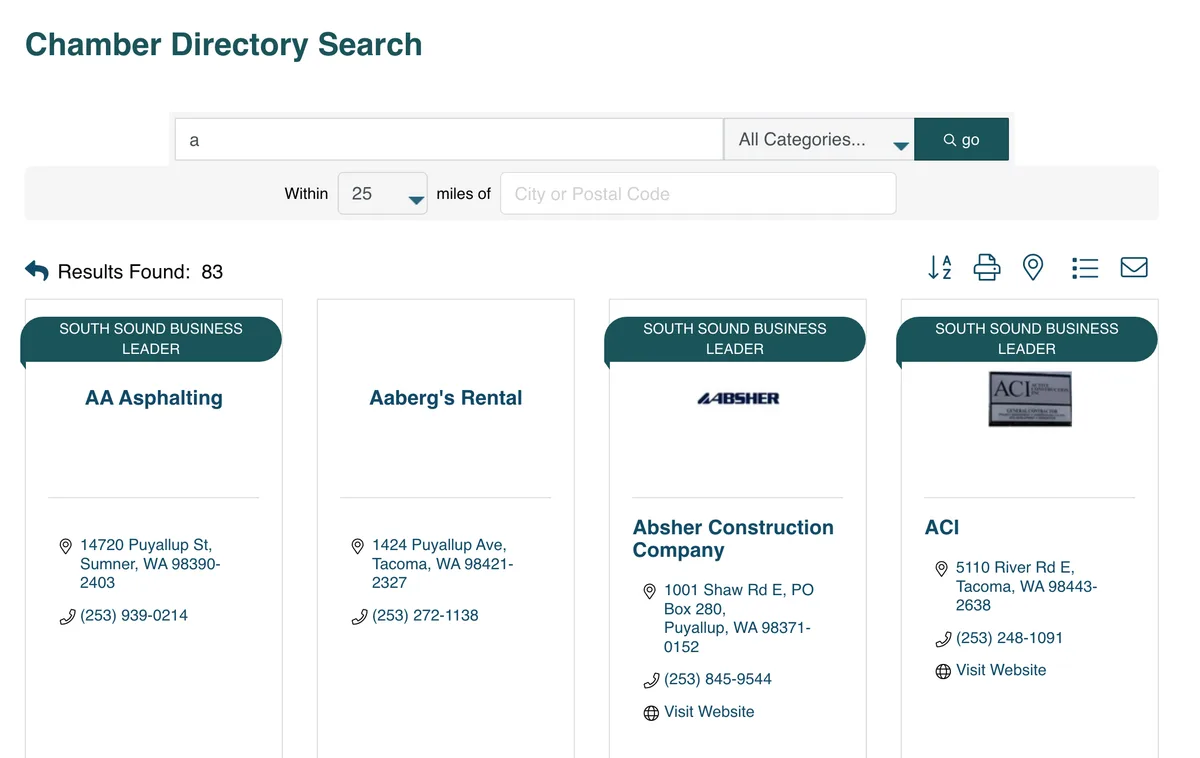
That gave 226 listings. 206 of them published a website address on their member page, which left 201 distinct domains once duplicates were removed. Requesting each homepage with redirects followed, 159 returned readable HTML. The rest refused us: 19 answered 403, 16 did not answer at all, and a handful returned other codes. Every measurement below is taken from the HTML the server sent, with nothing executed, so anything a site adds with JavaScript after delivery is not counted and every figure is a floor rather than a ceiling.
Three honest limits. Chamber members are businesses that pay for a membership, which tilts the sample toward firms with a budget, so a random sample of local businesses would almost certainly look worse. The letter A is an arbitrary slice, but it was fixed before anything was measured, which is the point. And a homepage is one page; the rest of a site can be in a different state entirely.
The two signs almost nobody fails
Every list starts in the same two places, and both are now close to solved. 158 of the 159 homepages carry a mobile viewport tag. 151 of them resolve to HTTPS, leaving eight that still answer on plain HTTP. If you are choosing a website to worry about on the strength of those two checks, you will be worrying about roughly one business in twenty.
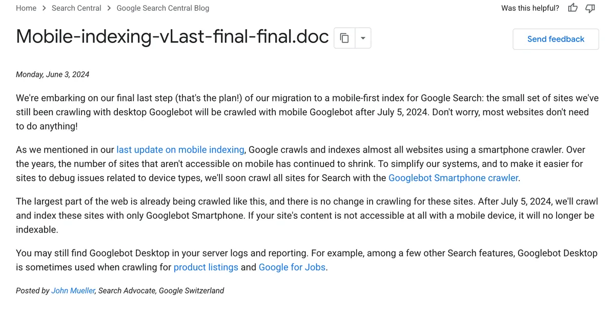
Google has been saying the same thing in its own way. In a post dated 3 June 2024, John Mueller announced the last step of the move to a mobile-first index: after 5 July 2024 every site would be crawled with the smartphone crawler, and the post notes that the number of sites not accessible on mobile has kept shrinking year after year. The consequence it states is blunt. Content that cannot be reached at all on a mobile device stops being indexable. That is a real cliff, and in our sample exactly one site is anywhere near it.
That one is instructive. Its generator tag names a hosted site builder from an earlier era of the web, it loads jQuery 1.4.2, which jQuery released on 19 February 2010, and its layout is pinned to a fixed pixel height by a script at the top of the page. That site does need replacing, and no measurement was required to work it out.
One caution before you tick the box on your own site. A viewport tag means the page asked the browser to lay out at the width of the device. It does not prove that the layout then works, that the tap targets are big enough, or that a menu opens. It is necessary and it is not sufficient, which is why the first check in the list further down is still to pick up your phone.
What was actually missing
Move past the two famous checks and the picture changes. 107 of the 159 homepages carry JSON-LD structured data, which leaves 52 with none at all. 125 serve an h1 in their HTML, so 34 do not. 127 have an og:title and 32 do not, which means a link to those pasted into a message or a group chat renders without a proper headline. Some of those gaps will be filled by JavaScript after the page loads, which is the caveat on the whole sample, but the version a crawler sees first is the version we measured.
Structured data is worth pausing on, because it is the largest gap and the least discussed. Google's own description is that it uses structured data to understand the page and to show it in a richer appearance, and its gallery of supported features includes a Local business type that describes exactly the kind of firm in this sample: name, address, opening hours, phone number. A third of these businesses have not told a search engine any of that in a format built for the purpose. Not one of the ten readable articles about redesign warning signs mentions it.
The footer year is the only visible sign that is a sign
68 of the 159 homepages print a copyright line dated 2026. 14 stop at 2025. 30 are dated 2024 or earlier, with a tail running back through 2013 and 2011 to two sites at 2006 and one at 2003. The remaining 47 print no copyright line anywhere in the page.
Read it in both directions. A 2019 footer is not proof that a site is neglected, because some businesses deliberately print a founding year, and a 2026 footer is not proof of maintenance, because almost every modern theme inserts the current year automatically and would keep doing so on a page nobody has opened in three years. What the number really measures is whether anyone chose the year, and on 30 sites the answer was somebody, once, a while ago.
It is still the most useful of the visible signs, for one reason: your customers can see it and your competitors cannot fake it. And it is a single line of code. If a proposal quotes you for a new website and the evidence offered is your footer, you are being sold a car to fix a tyre.
Slow is real, and it is mostly pictures
Speed is the one item on the standard list that survives contact with data, and the data also says what to do about it, which is rarely a rebuild. The thresholds are published: a page should reach its Largest Contentful Paint within 2.5 seconds, respond to an interaction within 200 milliseconds, and hold layout shift at 0.1 or less, each measured at the 75th percentile of real visits.
Where real sites sit against those numbers is published every year by the HTTP Archive Web Almanac, and its 2025 edition is unambiguous. On mobile, 81 percent are in the good band for layout stability and 77 percent for responsiveness, but only 62 percent for loading, and 13 percent are outright poor on it. Passing all three at once is a much smaller club: 48 percent of mobile sites, up from 32 percent in 2021. Server response time is the other weak spot at 44 percent. So the failure, when there is one, is nearly always loading.
That same chapter tells you what is loading. On 85.3 percent of desktop pages and 76 percent of mobile pages, the largest element on screen is an image. The formats those images use are JPG on 57 percent of pages and PNG on 26 percent, with WebP on 11 percent, so the single most important image on the average page is still delivered as a JPG or a PNG. About 16 percent of pages lazy-load that exact image, which delays the one thing the visitor is waiting for. And only 13 percent of desktop pages and 15 percent of mobile pages pass Lighthouse's render-blocking resources audit.
Read that list as a work order. Resize the hero image, convert it, stop lazy-loading it, and move two scripts out of the way. Total blocking time on mobile has a median of 1,916 milliseconds against 92 on desktop, and that gap is JavaScript execution rather than a design decision. None of those four jobs requires a new website, and all four of them are undone the moment somebody uploads a 4MB photograph to the new one.
What Google says a faster site will and will not do
If the plan is to redesign for rankings, read Google's page experience documentation first, because it argues against the plan more clearly than we could. On whether there is a page experience score that ranking uses, it answers: "There is no single signal." It confirms that Core Web Vitals are used by its ranking systems, then says that good results in those reports do not guarantee that pages rank at the top, that chasing a perfect score for its own sake may not be the best use of your time, and that page experience aspects beyond Core Web Vitals do not directly help a site rank higher.
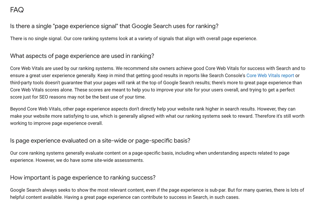
The sentence that should settle most redesign arguments is the one about relevance. Google says its systems set out to show the most relevant content even when the page experience is sub-par. A faster site is worth building because visitors stay on it, not because a slow one is being penalized into obscurity. And it is worth knowing that the move itself carries risk in the other direction: rankings can and do dip while a site changes, which is a subject in its own right and one we have written about in redesigning without losing your rankings.
The same page also publishes a short self-assessment that is more useful than any warning-sign listicle: does the page have good Core Web Vitals, is it served securely, does it display well on mobile, does it avoid excessive ads, does it avoid intrusive interstitials, and can a visitor tell the main content from everything else. Six questions, all answerable in an afternoon, none of which asks whether the design looks current.
Fix it or replace it
Here is the whole argument in one table. The left column is what people describe when they call us. The right column is what the problem usually turns out to be once somebody looks, which in most rows is not a website.
| What you noticed | How to check it | What it usually turns out to be |
|---|---|---|
| Pages feel slow on a phone | PageSpeed Insights on your three busiest URLs | Oversized images and third-party scripts |
| Text is tiny, buttons are hard to hit | Open the site on your own phone on mobile data | A theme setting, unless there is no viewport tag at all |
| No padlock in the address bar | Type the address with http and watch what happens | A hosting setting and a redirect rule |
| You appear in Google as a plain blue link | Google's Rich Results Test | Missing structured data, a template edit |
| Shared links look broken in chat | Paste your URL into a message to yourself | Missing og tags, a template edit |
| The footer says 2019 | Scroll to the bottom | One line of code |
| The content is wrong or old | Read your own service pages end to end | A writing job, and the most common real problem |
| Traffic fell off | Search Console, pages and queries, year on year | Something specific. Diagnose before you spend |
| You cannot change a phone number yourself | Try to, with a timer running | Training, a new editor, or a rebuild, in that order |
| Nobody knows where the site is hosted | Ask who holds the registrar and host logins | An ownership problem wearing a design costume |
| The platform has been discontinued | Look for the vendor's current pricing page | A rebuild |
| It cannot take a booking or a payment | Try to add one | A rebuild, if the platform has no path to it |
Two rows in that table are rebuilds. Ten are somebody's afternoon. That ratio is roughly what we see in the inquiries that reach us, and it is the reason this article exists.
When the software underneath is the reason
Sometimes the platform genuinely is the problem, and it is worth being precise about when. Of the 159 homepages, 67 are WordPress, identified by the wp-content or wp-includes paths in their own markup. 31 of those also print a core version in a generator tag. 21 are on 7.1, which the WordPress version API gives as the current release, and 10 are behind it, the oldest sitting on 6.3.5.
Being a version behind is a maintenance question, not a rebuild question. A discontinued platform is different, because there is no version ahead of you. So is a dependency that has stopped moving. jQuery shipped version 4.0.0 on 17 January 2026, its first major release in almost a decade, and it drops support for Internet Explorer 10 and below. Microsoft ended support for the Internet Explorer 11 desktop application on 15 June 2022, keeping only an IE mode inside Edge that it commits to through at least 2029. A site that still carries browser-specific workarounds for that era is carrying weight for a browser Microsoft stopped supporting four years ago.
Weight is measurable too. The median homepage in our sample returned 193KB of HTML before a single image or script was fetched. The 90th percentile returned 773KB, 27 sites returned more than 500KB and 12 returned more than a megabyte, the largest at 1.59MB. Those figures are uncompressed, since we did not ask for compression, so treat them as a comparison between sites rather than as what a visitor downloads. A megabyte of markup on a homepage is not in itself a design flaw, and a new design is not the only way to reduce it.
The four reasons that survive scrutiny
Strip out everything that a competent afternoon would fix and four reasons remain. Each one has the same shape: the current site cannot get there from here.
You cannot change it without paying somebody. This is the one that quietly costs the most, because it turns every small edit into a purchase order and so the edits stop happening. Test it before you accept it, though. Plenty of the sites we are asked to replace can be edited perfectly well by a person who has never been shown how.
The site describes a business that no longer exists. Services you dropped, a location you left, prices from two years ago, a team page of people who moved on. If the gap between the site and the company is measured in offerings rather than pixels, rewriting inside the current site is usually faster and always cheaper. It becomes a rebuild only when the structure itself has no place to put the new thing.
It cannot do the job you now need it to do. Take a booking, take a payment, run a members area, publish in two languages, hold a real product catalog. Try to add it first. If the platform has no path, that is a genuine trigger, and it is the one where a new site pays for itself in something other than a feeling.
You do not control it. If the domain, the hosting, the analytics or the code sit under somebody else's account, the redesign question is premature; the ownership question comes first, and we wrote a whole piece on what to check in who owns your website. Rebuilding on land you do not own repeats the problem in a nicer typeface.
There is a fifth that we will defend but only with evidence. If your site looks like a different decade from the three companies you lose deals to, that is a real commercial problem. The evidence is not your own reaction to your homepage; it is a customer telling you, a salesperson describing the moment a call cooled, or a set of quotes you did not win. A feeling is a reason to measure. A pattern is a reason to spend.
Six checks, free, about an hour
Run these before you take a single meeting about a redesign. They cost nothing, they need no agency, and between them they will tell you which column of the table above you are in.
| The check | Where you run it | What a pass looks like |
|---|---|---|
| The phone test | Your own phone, on mobile data, not the office network | You can read, tap and submit without pinching |
| Loading speed | pagespeed.web.dev, on your three busiest pages | LCP under 2.5s, INP under 200ms, CLS 0.1 or less |
| Machine-readable identity | Google's Rich Results Test | At least one valid item, and the right business details in it |
| What Google already gives you | Search Console, pages and queries, the longest range it offers | Impressions on the services you sell, not just your name |
| The ownership check | Registrar, host, analytics, code repository | Your company on all four accounts, and you can log in |
| The edit test | Your own CMS, with a timer | You change a headline and publish inside ten minutes |
The last two are the ones people skip and the ones that decide the most. A site you cannot edit and do not own is a rebuild whatever its Lighthouse score says. A site that passes both is almost always worth improving rather than replacing.
What we would spend on first
If someone handed us a budget and one of these sites, this is the order, and the design is fifth.
First, the words. Wrong content is the only defect on this list that actively misleads a customer, and it is among the cheapest to put right. Second, the images, because the Almanac says loading is where sites fail and images are what is loading. Resize, convert, and stop deferring the one at the top of the page. Third, the machine-readable layer: structured data, page titles, an h1 that says what the page is, og tags so a shared link looks like something. Fourth, the pages that do not exist yet, because a service with no page cannot rank for itself and no amount of visual polish substitutes for a missing page.
Fifth, and only fifth, the design. Not because design does not matter, but because a new design applied over the four problems above is a more expensive version of the same site. When those four are done, a great many businesses discover that the thing they wanted from a redesign has already happened.
Our numbers, and the shorter answer we give more often
For the sake of putting ourselves next to everyone else: working with us is a monthly subscription, $1,000, $2,500 or $5,000 a month, with no minimum and no contract, so you can pause or cancel at any point. Something over 200 projects have shipped with us, mostly for service businesses in the US and Europe. When a rebuild is the right call it tends to be for the reasons in the section above rather than for the reasons in the search results.
The shorter answer is the one we give more often, and it usually arrives inside two days of the first message. If your content is four years out of date, hire a writer, not us. If the only measured failure is loading and your platform is healthy, pay somebody for a day of image and script work and re-run the test. If you can already edit the site and simply have not been taught how, two hours of training is a better purchase than anything on our price list. A redesign will fix those things, in the way that moving house fixes a blocked sink.
Where we do earn the money is when the four structural triggers are real: the platform is finished, the site cannot carry what the business now sells, editing is a purchase order, or the whole thing needs moving onto ground you own. The redesign we shipped for Cornerstone Healing Center lifted website conversions by 20 percent, and the reason they called was that the old site had nowhere to explain their programs properly. Eden Digital, whose site we also built, grew revenue tenfold. Both of those were capability problems before they were design problems, which is the pattern.
The one-sentence test
Here is the exercise we would run instead of reading another list. Say this out loud, in one breath, with no conjunctions and no adjectives, and fill both blanks with something a stranger could verify.
We need a new website because the current one cannot ______, and we have already tried ______.
Four completions fail the test, and they are the ones we hear most. Cannot look modern is a taste, and taste is not a capability; the fix might be a typeface. Cannot rank higher names an outcome rather than a limitation, and Google's own documentation says relevance beats page experience, so the missing ingredient is probably a page you have not written. Cannot convert better is the same shape, and until you have measured where visitors leave you are buying a solution to an unlocated problem. Cannot keep up means nothing at all; ask keep up with what, and the answer is often a competitor's homepage seen once.
Four completions pass. Cannot take a booking. Cannot be edited by us. Cannot be moved, because the company that built it has closed and nobody has the files. Cannot show the three services we added last year, because there is nowhere in the structure to put them. Every one of those names a thing the site is unable to do, and every one is checkable by somebody who does not work for you.
The second blank matters as much as the first. If you cannot say what you already tried, you are not buying a website, you are buying the end of a conversation you have not had yet. Try the cheap thing, measure it, and if it fails you will walk into the agency meeting holding evidence instead of a mood.
Twenty minutes, this week
Open your own site on your own phone, on mobile data, away from your desk, and try to do the thing a customer would do. Then run your busiest page through PageSpeed Insights and write down three numbers. That is twenty minutes, it costs nothing, and it converts the entire question from an argument about taste into two facts and a decision.
Then write the sentence. If the blank names a capability, get quotes and read them carefully, including ours. If it names a feeling, you have just saved yourself several thousand dollars and you should spend an afternoon on your service pages instead. Related reading: what to check before you sign anything, in how to choose a web design agency, and what the platform you are on will and will not let you take with you, in website builder versus hiring a designer.
Frequently asked questions
Test whether the site is unable to do something, rather than whether it feels tired. Four situations genuinely call for a rebuild: you cannot edit the site yourself, the platform under it has been discontinued, the structure cannot hold what the business now sells, or the domain, hosting and analytics sit in someone else's account. Every other item on the usual list of warning signs, including slow pages, a dated look and poor search visibility, is content and configuration work that can be done inside the site you already have. Run the six free checks in this article first, then decide.
On no fixed schedule, because the calendar is not what breaks. The three to five year interval that circulates is repeated by two of the ten redesign articles we read for this piece and sourced by neither of them, and a calendar cannot tell you whether your platform still works or whether your content still describes your business. Use capability instead: rebuild when the site cannot do something you need it to do and there is no path to adding it. Sites that get edited regularly, keep their images in order and stay on a maintained platform can run for many years without a rebuild, while a site launched last year on an abandoned builder is already a problem.
Rarely, because the usual cause is images rather than architecture. Measurements published in the 2025 Web Almanac show that the largest element on the page is an image on 85.3 percent of desktop pages and 76 percent of mobile pages, that 57 percent of those images are still JPG and only 11 percent are WebP, and that about 16 percent of pages lazy-load the very image the visitor is waiting for. Resizing and converting images, removing a couple of third-party scripts and unblocking the render path will usually move Largest Contentful Paint further than a new design would, at a fraction of the cost.
Not by itself, and it can cost you rankings during the move. Google's page experience documentation states plainly that there is no single page experience signal, that good Core Web Vitals scores do not guarantee top rankings, and that its systems set out to show the most relevant content even where page experience is poor. What does move search performance is content that answers a query, pages that exist for the services you sell, and structured data that lets a search engine understand the business. All three of those can be added to your current site.
Check first, because true mobile failure is now rare. Of the 159 small business homepages we measured, 158 carried a mobile viewport tag; the single exception ran on a discontinued site builder with a JavaScript library released in 2010. If your site has the viewport tag and merely looks awkward on a phone, that is usually a theme setting or a template fix. Google finished moving to mobile-first crawling after 5 July 2024, and its rule is about accessibility rather than beauty: content that cannot be reached at all on a mobile device stops being indexable.
Two very different prices sit behind that question, which is why measuring first saves so much. Fixing content, images, structured data and page titles inside an existing site is measured in hours of somebody's time. A full rebuild is a project: with us the full website is the Growth Partner plan at $2,500 a month, which you can pause or cancel at any point, and agencies across the market price the same job anywhere from a few hundred dollars to five figures. The expensive mistake is buying the project when the hours would have done it.
You can protect most of it, but expect movement while the change settles. The work that matters is keeping your URLs where they are wherever possible, mapping redirects for every URL you do change, keeping your page titles and body content rather than rewriting everything at once, and watching Search Console daily for the first two weeks after launch. Google's own site move documentation tells you to expect temporary ranking fluctuation during the move and says a medium-sized site can take a few weeks or more to settle, so plan for a dip and a recovery rather than for no dip at all.
A refresh changes what is on the site, a redesign changes the site itself. A refresh means rewriting copy, replacing photography, adding pages for services you now sell, fixing images and structured data, and adjusting colors and type inside the existing template. A redesign replaces the templates, and often the platform, which means every URL, every redirect and every integration is in play. Most of the outcomes people want from a redesign, including looking current and performing better in search, are available from a refresh at a small fraction of the risk.
 SEO & Growth
Aug 19, 2026 · 15 min
How to Choose a Web Design Agency in 2026: What to Check Before You Call
Most of the advice on picking an agency measures how a seller behaves in a sales conversation. Four public records and two free tools tell you more, and you can run all of them in half an hour before you speak to anyone. We ran every check on ourselves and published the results.
 SEO & Growth
Aug 13, 2026 · 14 min
Website Redesign Without Losing Your Google Rankings in 2026
Most redesign guides promise you will lose nothing, which is not what Google's own documentation says. Here is what actually causes permanent loss, what the platforms let you redirect, and the 180-day clock behind every domain move.
 SEO & Growth
Aug 9, 2026 · 13 min
Delivery App Fees in 2026: What They Take and What Ordering Direct Costs
Uber Eats raised its US marketplace fees in March 2026 and New York's famous 15% cap now tops out at 43%. Here is what each channel costs on the same $40 order, at rates the companies and regulators publish themselves.